Inevitably a couple items would be overlooked when I rebuilt the Nest. Manually overhauling old HTML files into a more modern system naturally lends itself to mistakes. And so it is that while writing a new review for SECBASE Revisited I discovered that I'd already written one back in the 90's.
This was initially a conundrum: I didn't want to obscure my original thoughts, but I'd also put in the time to write up something that reflects my current opinion of the mission and didn't want to cast it aside.
So I decided to use both, and begin a new series of features wherein I'll revisit old missions I've already reviewed to give them a second glance. The purpose of each will be to explore how opinions can change over time with exposure to new experiences, to re-examine some of the design decisions authors made, or to highlight particular elements of missions that were new or exceptionally well-crafted.
Having written the new review and re-read my original critique I am pleased that many of my original thoughts hold up. I feel a bit better equipped nowadays to articulate my criticisms and recognize some of the technical aspects of the mission, but my overall impression is remarkably consistent.
Below you'll find my new review, and I hope you'll check out the original and enjoy comparing the two.
New Review of 'SECBASE Revisited'
How to even approach reviewing a mission created (in part) by one of the pillars of the Dark Forces editing community?
Upon seeing the name Yves Borckmans in the author list of this mission my expectations rose, and immediately so did my blood pressure. What would be the point of me, who never released a mission, penning a critique of this map? But down that road leads madness (and probably another blog post)
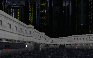
Once you get into the thick of things you'll discover that despite the pedigree this is just another mission, albeit a well constructed one. The layout of the facility is excellent. It gives you the impression of an elaborate base without falling into the trap of recreating the reality of such locations, parallel hallways replete with rectangular rooms. No space ever feels square or like repetitive filler. While the mission is designed in some respect as a puzzle maze each area is distinctive and captivating, often allowing you to see portions of the facility you have already visited or have yet to reach. Understanding the connections between all the pieces is part of the fun.
I mentioned Yves at the beginning, but it's important to call out that the text file credits Serge Debroeyer with the bulk of the work. Given that Yves was the author of DFUSE and Serge the primary tester they obviously know how to make the engine sing, and there are a few areas that highlight the vertical possibilities of Dark Forces. The central sewage room has multiple levels of action, crisscrossing routes, and different surface types to give you a dynamic hub for a lot of the level traversal. It's the sort of space you don't see very often even in the original missions, far more intricate than the normal single level rooms or even stair-stepped areas, and with verticality that is usable by the player and not just serving as an epic viewpoint.
Texturing is well aligned, everything feels so solid that it almost seems silly to mention it. Door colors correspond to the key needed to open them which makes some of the looping back a bit easier to keep in your mind. Lighting and texturing are coordinated in subtle ways to draw your attention to important elements, especially doors. But one big hangup for me is the constant use of yellow caution stripes and other dingy surfaces. It gives the base a very industrial feel that clashes with the big city setting and Imperial decor that we're used to. Granted, as an entry point the waste and cargo area is styled appropriately. But I was hoping for more variation as we got closer and closer to the plans, and didn't find it.
The sewage running through the entire base makes for a excellent raison d'etre for how you navigate the different sections of the base and allows the authors to progressively expand the areas available to you without it feeling like yet another locked door. But like the yellow stripes, the central presence of the sewage in this environment feels out of balance.
I'd love to know the reasoning behind the choice to grunge up the environment, because it is clearly a choice and not just laziness with texture selection. Everything coordinates too well to be accidental. If this were a different mission, not the theft of the Death Star plans, none of this would be bothering me. But...
There are only a few hints at true nature of the base scattered around the facility, and when you do finally uncover the hidden location of the plans it feels a bit underwhelming. Instead of a high-tech operation concealed within the bowels of a sewage plant (which would have been wonderful, akin to the slow roll-up reveal of the plans in the original mission) you discover a couple more rooms that feel more or less the same as the rest of the map. For all the evident sophistication in the construction of the mission, the marriage of story and gameplay falls short.
Overall
I've mentioned the technical accomplishments of this mission several times; especially for the era this mission stands out. It's a showcase for DFUSE and what can be accomplished with it. Even more impressive is that each of the set pieces feels like a natural part of the environment and not just an excuse to demonstrate the editors' capabilities. The construction won't overcome the narrative disconnects throughout the mission and the emotional letdown at the end, but unless you're really sick of retrieving the Death Star plans I think you'll still find a lot to enjoy here.

