Island InvasionIsland Invasion
Find the Death star plans, its hidden in a recuiting base on an island on a small planet.…
Kyle You are being sent to rescue rebel prisoners that have been captured by the empire. The base that the prisoners have been sent to is one that we are unfamiliar with. You will not have proper maps for this prison.


First impression: this is one screwed up level. In parts it seems like the castle idea is actually going to work out, and in others the author seems to have lost all sense of the Star Wars universe and how it works, and what it means.
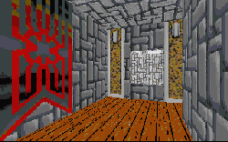
The idea of converting a castle to modern standards for Imperial use is not unheard of; in Timothy Zahn's novel Dark Force Rising the Empire reworked a castle on Jomark for the insane Jedi Master C'baoth. And several of the new textures made for the level are really good, and when combined with some of the old Imperial banners from Dark Forces, they make up a great medieval environment. It's not the idea that fails in this level. It's the execution of that idea. Why would anyone in their right mind fill a level (any kind of level) with dozens of Darth Vaders? And why is an Imperial prison crawling with bounty hunters? And why do doors that slide up to open have doorknobs? And why aren't the doorknobs broken off when the door slides into the slot?
There are hundreds of unanswered questions about this level, not the least of which is the design. The castle is incredibly cramped in some places, requiring you to come in at just the right angle to squeeze by. That ends once you get down below, but once in the dungeon, you lose your map! I understand that the description said you would not have a map going in, but why can't the HUD create a map as it goes along, just like every other level? To make matters worse, the entire lower portion is a giant maze, consisting of right angles everywhere, and every wall covered with the same texture. There's no way to find your way around, short of making your own map, or just by blind luck. This part absolutly drove me crazy, but really only set me up for the next section.
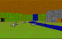
At this point, the same textures have been used over and over and are quickly becoming obnoxious. Apparently the author thinks so too, because the bottom of the castle is a pitch black pit, where you can't see anything. And of course the map is still out. If you flip on your headlight you'll quickly turn it back off. The neon green moss covering the walls is enough to blind you. I appreciate the efforts to make new textures, but I wish that they would be created with some taste, and placed with the same idea in mind. The same thing time after time taxes the patience. Here the thought was that one stone texture would fit the bill for all the areas of the castle. But LucasArts didn't use just one metal texture for good reasons, and the one texture that dominates this level could have used some variety as well.
Strangely enough, I found myself enjoying the level, at least at certain points. Needing to jump to get up to the ramparts was fun, and flying through the windows of the keep was something I wish I'd thought up. This level has it's good points. So I can't really discard it, but I can't put it on a pedestal either. Just set it in the middle pile, and try it if you're curious.