Dark Tide: Episode IV - EmpireDark Tide: Episode IV - Empire
It is a time of great danger for Kyle Katarn. Having just espaced the INVISOR he makes his way into the heart of the Empire. His friend and co-pilot Jan…
The Imperials are updating their stormtrooper weaponry and armor. They are currently conducting tests of a new jetpack on the Star Destroyer Oppressor IV. Your job is to bring pack one of the jetpacks, and the plans for their design. You copilot Jan was captured soon after sending us this information, so you will need to break her out as well. You will also have to be on guard because Emperor Palpatine's twin brother is supposedly on board.

I was very excited about the level for the first few sentences of the description. But then my enthusiasm quickly went downhill. The plot seemed great up until he included that bit about Palpatine's brother. I'd like to think I'm fairly inclusive when it comes to plot ideas, but this seems a little out of reach. I wonder why he couldn't leave well enough alone and turn out a great level.
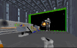
As it is, the level feels like it's gone overboard. There are tons of new WAXs, new weapons for you to use, and new enemies. The idea for the stormtrooper jetpack works great, with the logic of Fett being applied to the troopers. I wish the author could have adapted the WAX for the trooper a little rather than just applying new logic since it appears to be walking through the air, but it's tolerable. But the real problem comes from the dozen other WAXs, some of which look great and some that don't. The TIE pilots are really light grey, and some others look like sketches. And then there's the Crow. He's redone the textures completely, and while this is not necessarily a small feat, the new ship looks terrible. My own opinion of course, but I'm not used to seeing bright flourescent ships sitting in the hangar of a Star Destroyer.
And speaking of the Star Destroyer, the level looks nothing like we might expect it to. I can't seem to find any resemblance to the ships we know and love, except the window patterns. The level is small, unsuitable for a Star Destroyer, the hangar bays open straight out to the side, the bridge is constructed oddly, and all around there are bright textures, nothing like the dark and foreboding colors from the movies. I'd like to know what was running through the author's head at the time he created this.
I can't help but think that if the author had taken some time to think out what he was trying to do, then set up a plan and tried to keep it simple, this level could have turned out great. As it is he seems to have fallen prey to that disease which claims first-time authors; simply, he tried to put too much in the level when he could have put the same amount of effort into a smaller idea and done a great job.
I wouldn't bother with this one. If you want a Star Destroyer, there are better ones around. If you want Boba Fett and lots of stormtroopers and Emperor's acting like him, try this out. But if you're looking for a good solid level with decent ideas to provide a challenge, look somewhere else.